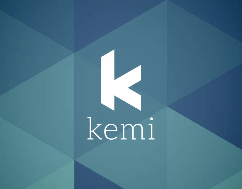
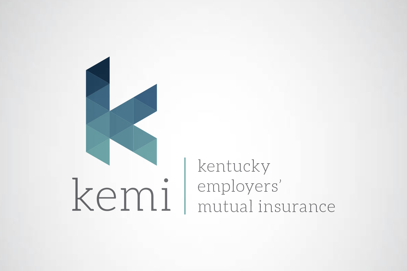
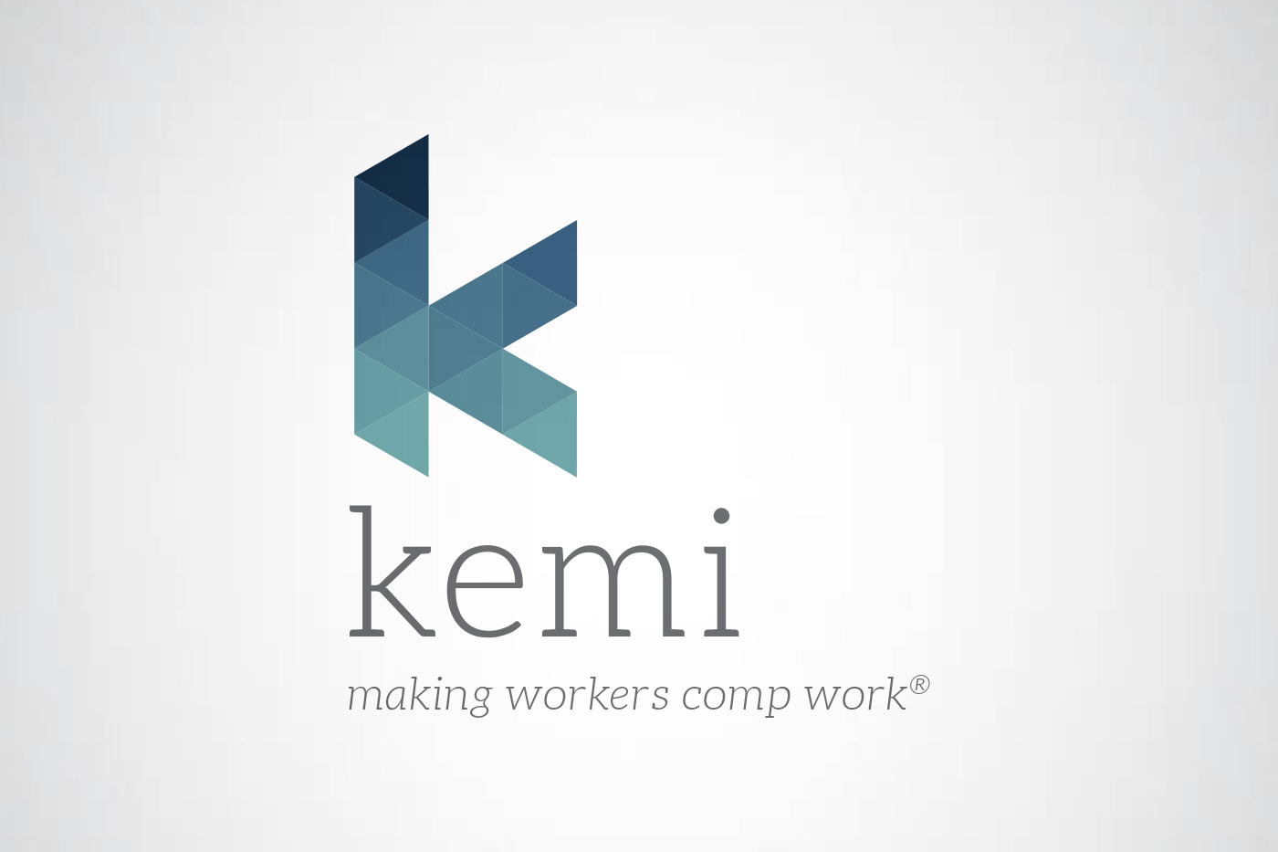
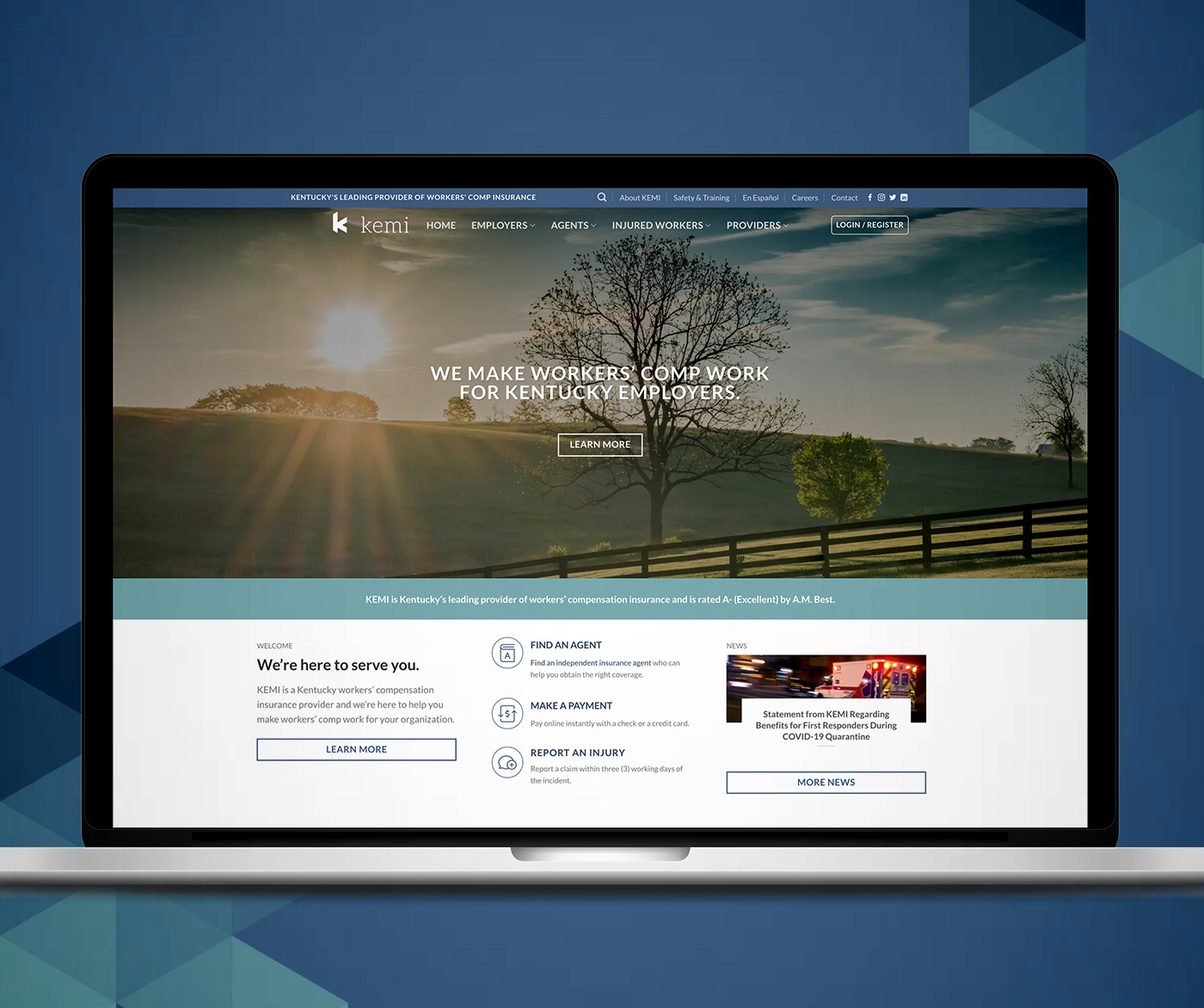
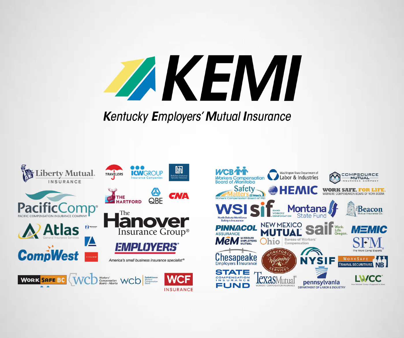
Background: KEMI, Kentucky’s leading provider of workers’ compensation insurance, requested a refresh of their brand identity: a modern, simplified mark representative of their stability, compassion and leadership. Their previous logo (shown below with competitive landscape) was 25 years old and market research showed it was no longer relatable to stakeholders.
Design: On its own, a triangle represents strength and stability – with a wide base, unmovable and solid in stance. Combined with others, it becomes a part of a collective – relying and trusting on one another to build upon the platform. The lowercase serif font is friendly, approachable, relatable and compassionate, yet still maintains a modern professionalism expected of a fiscally responsible company.
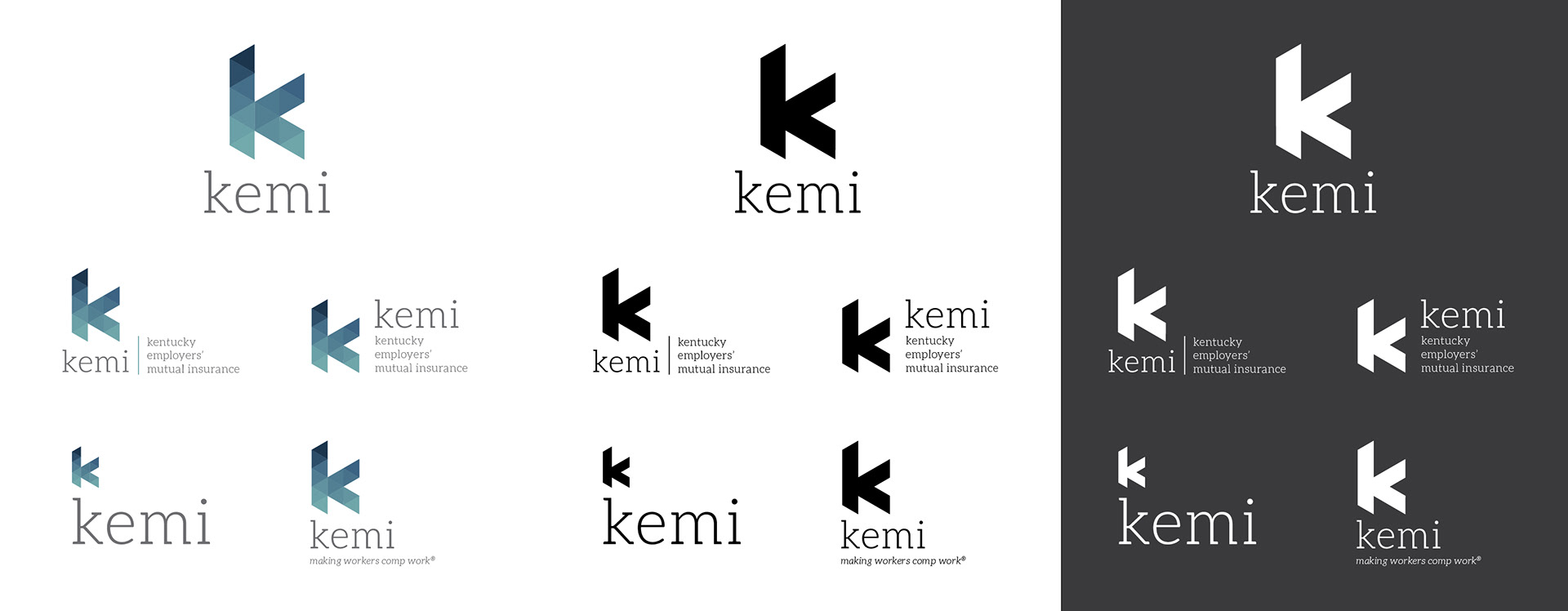
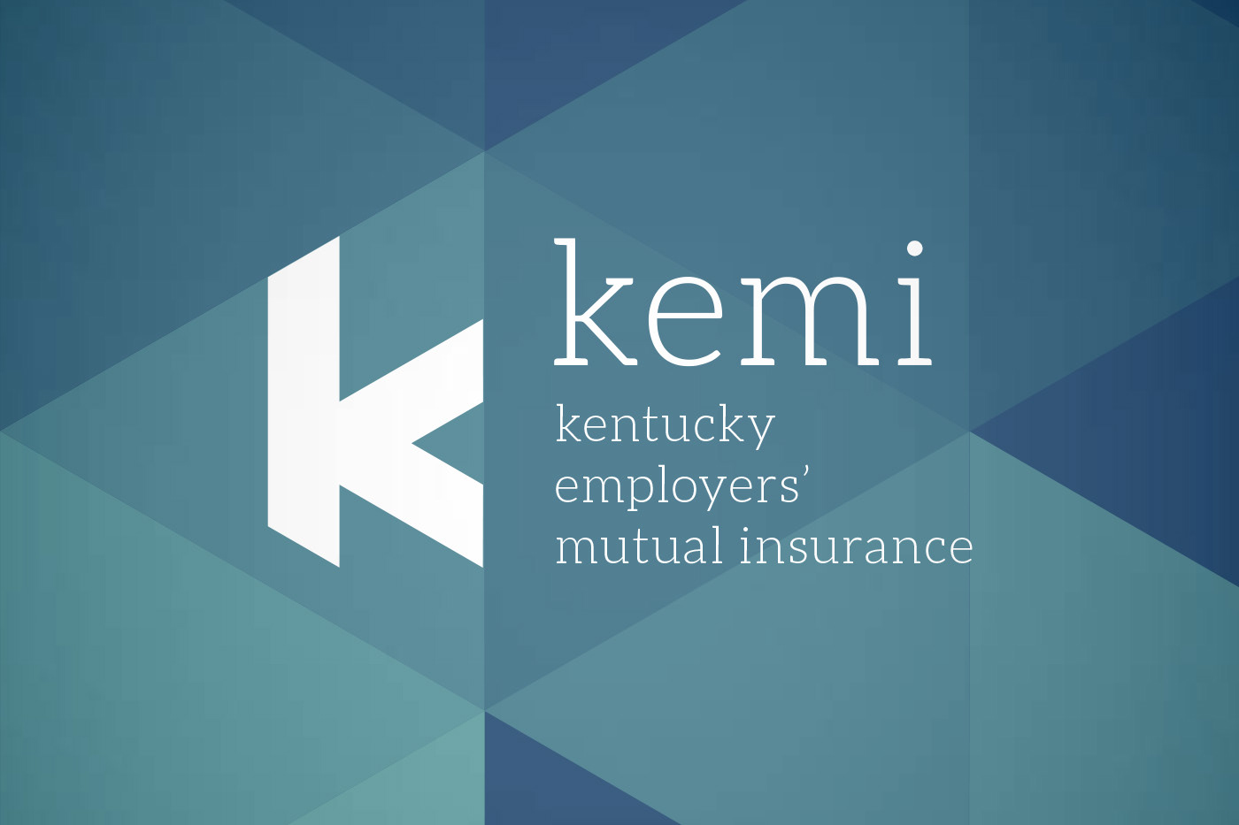
Note: The brand identity concept shown above was submitted as a proposal and
KEMI decided to go a different direction.
KEMI decided to go a different direction.